Mubadara
An Identity Built to Command Trust
In IT and security, trust is the product. The brand has to earn it on sight.
Mubadara Al Oula builds and protects the digital backbone of Saudi enterprises, from networks and data centers to surveillance and access control. Work like that is awarded on credibility, and for a brand serving the Kingdom, that credibility has to land in both Arabic and English. brandqraft built Mubadara an identity engineered to do exactly that.
Industry
IT Infrastructure & Security
Location
Saudi Arabia
Languages
Arabic & English
Scope
Brand Identity
A Brand for a Trust Business
Mubadara needed more than a logo. It needed an identity that could carry the authority of an enterprise infrastructure and security partner, and do it bilingually from day one.
brandqraft began with the brand guide as the blueprint: a single source of truth defining how Mubadara looks, reads, and behaves across every context, in Arabic and English alike.
Logo, Colour, and Type
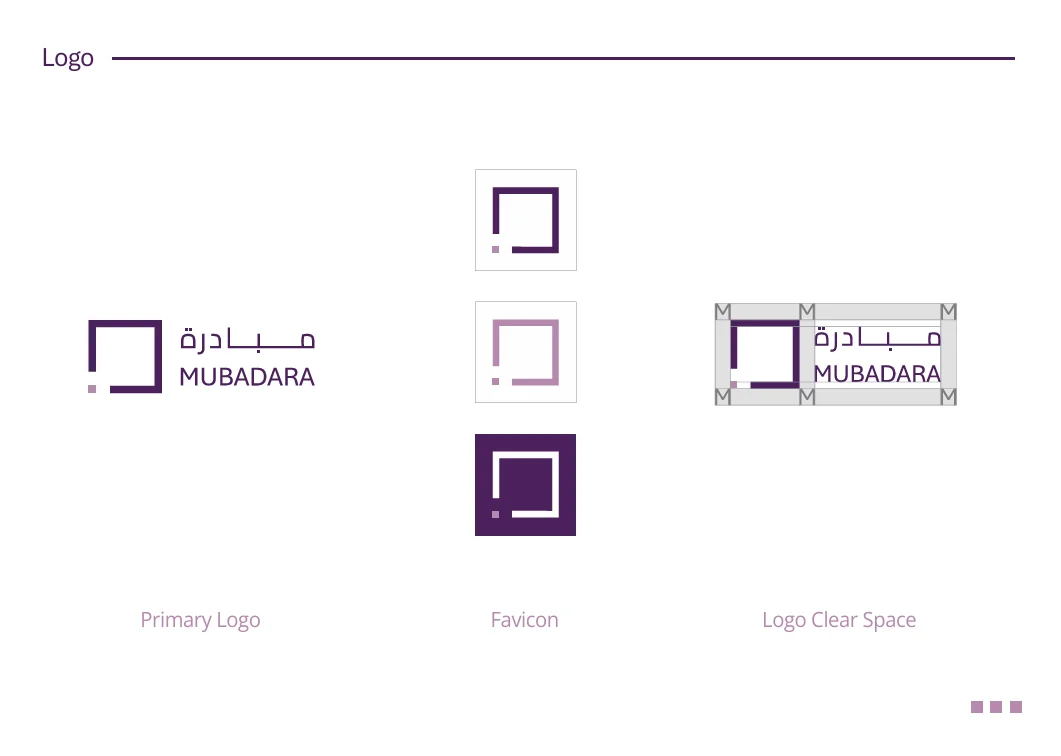
At the center of the system is a clean geometric mark, an open square motif that feels structured and secure, paired with a bilingual wordmark so the Arabic and English forms carry the same weight.
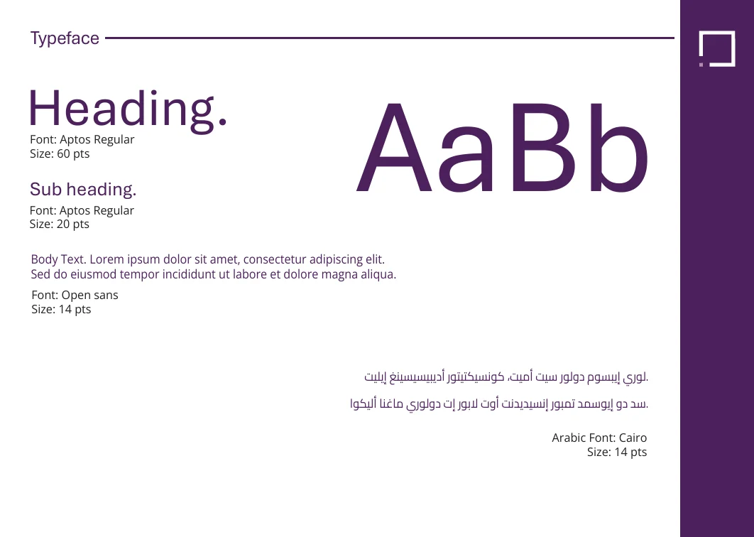
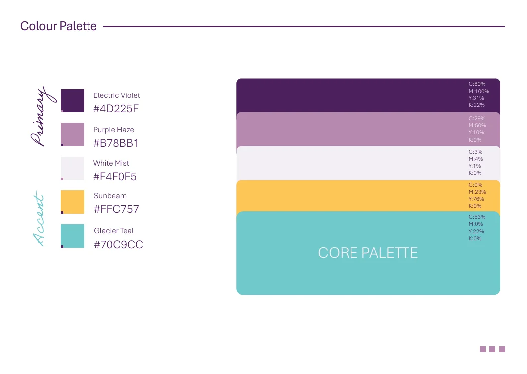
A violet-led palette gives the brand a distinctive, confident presence, while a disciplined typographic system handles English and Arabic with equal clarity.
Brand Colors
Electric Violet
#4D225F
Purple Haze
#B78BB1
White Mist
#F4F0F5
Sunbeam
#FFC757
Glacier Teal
#70C9CC
Brand Pillars
Authority
A precise, geometric identity that signals enterprise-grade credibility in IT and security.
Bilingual by Design
Built to read with equal confidence in Arabic and English, never as an afterthought.
Drive, Innovate, Succeed
The tagline that frames Mubadara's ambition and anchors the brand's voice.
Built to Scale
A complete kit, from favicon to stationery, ready for every touchpoint the business needs.
A System Ready for Every Touchpoint
Mubadara now has a complete, documented identity that holds together from a favicon to a building sign, and reads as trustworthy in both of its markets' languages. The same craft extended to Cyfi, its cybersecurity arm, giving the wider group one coherent visual standard.
What We Achieved
“In security, the brand has to look as reliable as the systems behind it. Mubadara's now does.”
A precise, bilingual identity gives Mubadara the credibility its work demands, before the first conversation even starts.
Strategy, system, and craft, delivered as one brand guide built to last.